Recently we have been changing and altering our main idea, and playing with different editing ideas. One of our main editing ideas was a split screen however this is not possible on iMovie '09 and the closest we would be able to use is picture in picture which is explained in this youtube clip:
We had this inspiration of an idea after watching requiem for a dream, it had a lot of indifferent and effective editing which we would really love to try and include in our teaser trailer.
Thursday, 30 September 2010

Tuesday, 28 September 2010
Make Up Practice - Bruises
We had a bit of a play around with dark eyeshadow and came up with this bruise. I think we got the colours right, so when we film a death scene, this is the technique we will use.


Storyboard changes
Our basic idea for the storyboard has chaned a little. Instead of the trailer focusing on the victim, we're now focusing on the victim's friend, which means the narrative will be about the friend abandoning the victim. This means the narrative changes from being about bullying to bullying and betrayal, which will be reflected in the trailer. This gives us more of a chance to add ideas, because the narrative is more open, and add in lots more camera shots, as it can be from different points of view.
Start: Equilibrium of main character walking into a party scene. Loud, fast paced, upbeat music, lots of people.
Walks through, editing switches from fast to slow, blurry, clear, black and white, etc. This will be done to emphasise drug and alcohol use. As the camera focuses on different people, we edit the scene to quickly flash to those people's deaths. Camera sound, etc.
(None of this is very clear, so that not too much of the narrative is given away.)
End: Yet to be confirmed...
We still need to decide actors, as they need to be perfect for the part and reasonably good at acting, storyboard completely, and play around with the macs more so we know we can actually achieve this effect.
Start: Equilibrium of main character walking into a party scene. Loud, fast paced, upbeat music, lots of people.
Walks through, editing switches from fast to slow, blurry, clear, black and white, etc. This will be done to emphasise drug and alcohol use. As the camera focuses on different people, we edit the scene to quickly flash to those people's deaths. Camera sound, etc.
(None of this is very clear, so that not too much of the narrative is given away.)
End: Yet to be confirmed...
We still need to decide actors, as they need to be perfect for the part and reasonably good at acting, storyboard completely, and play around with the macs more so we know we can actually achieve this effect.
Friday, 24 September 2010
Poster Analysis - Tormented

Wednesday, 22 September 2010
Magazine Cover Analysis - The Dark Knight


Both of these Empire covers were for the same month, letting the reader choose which cover they wanted. The actors are both in the same pose in the centre of the page, showing power and authority. Their faces fill most of the screen, showing that a large proportion of the magazine is about The Dark Knight. The layout of the cover is exactly the same, just with different colour schemes; blue for Batman and green for the Joker. This clearly relates to the film, appealing to the fan base. Also, as both these covers were released in the same month, this made the audience choose "sides", much like fans of Twilight have had to choose between Edward and Jacob. This idea of having to choose is commonly used in other Dark Knight related media, and helps add to the fanbase. The title of the film is clearly placed under the title of the magazine, showing that, although the Dark Knight is important, the magazine is more important in this circumstance. The colour of the title is black on one cover and white on the other. Although this could just be the colourscheme, so that the reader can clearly see the writing, it could also be related to the fact that Batman is good (white) and the Joker is bad (black.)
Monday, 20 September 2010
Website Analysis - The Unborn
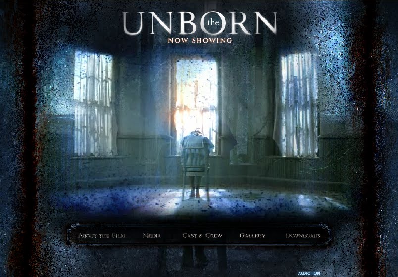
The Grudge website analysis

Analysing Saw website homepage

When you first log onto the site it has a introductory clip of a TV with Saw's face on (this is largely associated with the Saw movies and therefore a type of branding). The homepage uses dark colours, with the centre a silver colour and in the shape of a circular saw, iconic to the movie and also associated with slasher and gore movies. The title is positioned in the top right hand corner of the page, so the eye is immediately drawn to it. It is very user friendly as all the links to other parts of the site are easily seen and the image shakes when you hover the mouse over it. The typography still keeps with the codes and conventions of the genre. Links to the other Saw sites are easily accesable, and all in the traditional 'Saw' font which is unique to the saw films.The homepage has advertisments for saw merchandise and interviews with the cast which involves viewers more and gains interest and tempts them to buy it.
Magazine Cover Analysis - Empire

Friday, 17 September 2010
Codes and conventions of thriller posters
 The poster places the name of the famous actor at the top of the image, this will draw in fans of dicaprio so his fan base will be inticed to see the movie. The font is clear and bold, and in red which is a typical colour for the thriller and horror genres, The red most obviously suggests blood or death. The image is cleverly photographed and edited to show the many different layers and complications in the film. The main character is typically placed as the most prominent in the picture. The colour scheme of the picture is mostly blue and white and black which gives a futuristic and technological feel, and also makes the red title stand out.
 This poster contains some relevent text to the film. The text is at the top of the poster suggesting that the image is a result of the quote. The text seems to immerge from the clouds. Typically the actor/actress names are placed along the bottom of the poster, they are just above the title making them stand out, as the actors have big fan bases it is important for the success of the film, to have their names visible. As with most movie posters the main character of the film is the closest in the image to the front of the poster. Both inception and the Dark night include skyscrapers in the background of the image. The typical logo for the branded batman is also cleverly placed on the building. The angle of the shot is a low angle shot, so the viewer is looking up at the main character "Batman" showing he is superior to the audience and "superhuman". The Batman logo is also placed at the "golden section" of the poster.
 From psycho we are planning on using the idea of a death in shower scene. This poster draws on the most famous aspect of the movie psycho therefore marketing itself typically, the shower picture with her hand on the glass shows she is reaching for help, with the blood on her hands it shows desperation and therefore inticing the audience and suggesting the genre. The title is again apparent at the bottom of the poster along with the release date in red, the black and red colours are typical of the horror genre. The text is very simple and plain which draws the audiences eye to the picture. The picture of the hand is located at the "golden section" of the poster. The title is ripped suggesting destruction.
Thursday, 16 September 2010
Poster Analysis - Lucky Number Slevin
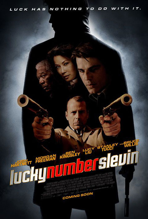

These two posters are for the same film, and they clearly display similar aspects to the film in very different ways. Red is used in both the images. The first poster has a small splash of red in the title of the film, whereas red is used as the main background colour in the second. Usage of this colour suggests that there might be blood in this film, and the guns in both posters reinforces this.
After a general discussion, the second poster is preferred, as it is much clearer and tells the audience more about the film. In the first poster, the audience are led to believe that the main character is the person in front holding the guns. This, in fact, is not true.
The first poster is mainly black, white and grey. The use of the silhouette is very effective, as this reminds the audience of 1960's horrors, and gives more clues as to the narrative of the film. The colour in the second poster includes more red, and the use of the gun to indicate the letter "L" is very effective. The positioning of the large gun also looks like a "7", confirming the audiences' belief that "Slevin" is supposed to sound like "Seven".
The posters are similar, however, because of the rule of thirds. The tag lines are at the top, the characters are in the middle and the title near the bottom. In the first poster, the eye is automatically drawn to the title, as the use of red and white stand out against the black and grey background. In the second poster, the eye is drawn to the characters and the guns, as these are the main details in an otherwise very simple poster. The character names are listed in both posters in a fairly large font. This shows the audience who is starring in the film, adding to the quality of the film. If the audience has seen the actors in other films, this may make them want to see this one also.
Wednesday, 15 September 2010
Poster Analysis - The Ring Two

The image looks static, like a television, which is iconic in the movie. This image is also seen in the first movie, so the audience will recognise it. This is a form of branding. The 'o' in two is a large circle, which is also branding. It also looks like a halo around the girl's head, making her seem angelic, which is ironic, as she is the villain.
The colours are typical of the horror genre. The poster uses black, white and grey, with a blue-ish tinge. This could tell the audience that the film is quite dark, and the lack of any colour indicates that the film is not a slasher.
The blurring is effective, and, depending on what we decide as our narrative, it could have some influence on what we include on our poster.
More Fake Blood...
Looks realistic and its cheap, we just need to make it in mass, we will experiment with the recipe and upload pictures and videos.
Tuesday, 14 September 2010
Analysis of Questionnaire Results
Question 1: Please select yout gender


Question 8: Our basic narrative idea is loosely based around bullying. Where do you think bullying is most likely to occur?

Question 9: As the audience, would it be more interesting for the bully/bullies to attack a single person or a group of people?

Most of the participants feel that it would be more effective for the bullies to attack a single person, which helps us to decide our narrative.
The last two questions refer to the bully/bullies and the victim. Most of the answers oppose each other, such as the bully's characteristics would be aggressive and the victims' weak. This suggests that when we show the bullies and the victim, they need to be opposing each other. The bullies need to be fat, unintelligent, scruffy and rude whereas the victim needs to be skinny, smart, well-dressed and kind. We need to think about this when we come to casting, as the physical appearance of the people clearly matters to the audience. They also need to be good actors, as the whole quality of the teaser trailer will decrease if the acting is bad.

As you can see, around two thirds of the participants were female.
Question 7: For the thriller genre, what would be the best location for most of the action?

The most popular locations are somewhere dark and creppy, and in the park. This tells us that these would be good places to film some of our scenes.
Question 8: Our basic narrative idea is loosely based around bullying. Where do you think bullying is most likely to occur?
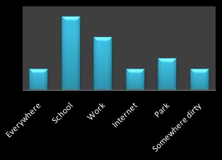
The results clearly show that school is the most obvious place where bullying is most likely to occur. This is good, because this helps us plan our narrative into something the audience would expect to see.
Question 9: As the audience, would it be more interesting for the bully/bullies to attack a single person or a group of people?

Most of the participants feel that it would be more effective for the bullies to attack a single person, which helps us to decide our narrative.
The last two questions refer to the bully/bullies and the victim. Most of the answers oppose each other, such as the bully's characteristics would be aggressive and the victims' weak. This suggests that when we show the bullies and the victim, they need to be opposing each other. The bullies need to be fat, unintelligent, scruffy and rude whereas the victim needs to be skinny, smart, well-dressed and kind. We need to think about this when we come to casting, as the physical appearance of the people clearly matters to the audience. They also need to be good actors, as the whole quality of the teaser trailer will decrease if the acting is bad.
Monday, 13 September 2010
Questionnaire Results
We posted our questionnaire on our facebook page, twitter, our blog and on our actual facebook statuses, so we got lots of interesting results.
Question 1: Please select your gender
67% Female
33% Male
Question 2: Please select your age
0% Under 14
78% 15-18
0% 19-25
22% 26-39
0% 40+
Question 3: Out of all the thrillers you have seen, which, in your opinion, was the best and why?
These were the main films mentioned - Cujo - "made me afraid of dogs"
Inception (mentioned a number of times) - " there was always something new that the audience was learning and it just kept you involved in the story line the whole time"
"its so unusual and has you thinking. the storyline is amazing and there isn't too much gun violence (like action gun scenes), but there are still loads of action, edge of your seat scenes. it draws you in, and isn't hard to watch"
Paranormal Activity - " tense, jumpy, makes you think after"
Saw - "the storylines are really intresting and get me into the films, the places the film is set e.g in a dark creepy underground place make it someones kind of worst nightmare"
The Number 23 - "as jim carrey is a good actor and he brought a lot to the film. story line is good an the twist at the end leaves the audience thinking."
Question 4: Out of all the teaser trailers for thrillers you have seen, which, in your opinion, was your favourite and why?
nception - "it showed you enough action to enable us to understand a bit about the storyline, but still kept some parts back to make you want to watch the film to find out more about the film like when they show the street curling up above their heads in the trailer"
"it leaves the audience wondering what the film is about and makes them want to find out more, making them look on the internet to find out more"
"it doesnt give you too much information but it gives you just enough to want to see more. the music is dramatic and makes you feel that the trailer is advertising excitement"
Paranormal Activity 2 - "If you've seen the first one, you know what to expect in the second one, making the audience see links between the two. If they enjoyed the first one, they automatically want to watch the second one"
Seed of Chucky - "have a guess"
The Others - "family tied up by physco's and they asked why us and the answer was "because you were home" pure class."
"Can't remember the film, sorry, but it started with like a fuzzy screen which makes it really freaky and then has kind of a creepy voice which really freaked me out and then went into some action of some scenes wi
th people screaming and blood going across the screen at the end."
"Can't remember the film, sorry, but it started with like a fuzzy screen which makes it really freaky and then has kind of a creepy voice which really freaked me out and then went into some action of some scenes wi
th people screaming and blood going across the screen at the end."
Question 5: In your opinion, what are the three most important features in any thriller teaser trailer?
Editing, music, sound, action, atmosphere, date of release, doesn't give too much away, intriguing, music, plot, "scariness", shock factor, shows main characters, tension, name of film, the way it finishes, ie, making the audience want to come and see the film.
Question 6: What features would you not want to see in a thriller teaser trailer?
Bad acting, the ending, it being too long, boring music, not saying release date, the whole film in 30 seconds, boring scenes, inappropriate sound for the genre, too much dialogue, too much or too little storyline, all creepy bits shown, leaving nothing to the imagination.
Question 7: For the thriller genre, what would be the best location for most of the action?
City
House
Everyday locations
Woods
Somewhere creepy and freaky eg, dark, empty house
In a dark and freaky place, like a dark house with no power and no way out
In a secluded area, such as the woods
Park
Park
Question 8: Our basic narrative idea is loosely based around bullying. Where do you think bullying is most likely to occur?
Everywhere
School
Work
Internet
Park
"Somewhere grotty-looking."
Question 9: As the audience, would it be more interesting for the bully/bullies to attack a single person or a group of people?
78% single person
22% group of people
Question 10: What main characteristics do you think make up a stereotypical bully?
Aggressive, chav, dirty looking, doesn't care, emotionally unstable, fat, female, female attacking female, has no real friends, him and his "posse," in a "in crowd," is always getting in trouble, jealous of person he's bullying, large, leafey, looks the part, male, male attacking male, not alone in bullying, not very smart, quite strong, rich, rude, scruffy, single child, someone who is/was bullied, stereotypical bully, surrounded by other bullies, tall, too much make-up if female, tough looking, trouble maker, ugly, unhappy at home.
Question 11: What main characteristics do you think make up a stereotypical victim of bullying?
Bit of a loner, brainy, colour of hair, colour of skin, different, dresses too smartly, emotionally unstable, fat, ginger, girl, glasses, has problems, has something wrong with him, illiterate, intelligent, interesting background, loner, male, "nerd," nerdy, no friends, ot very popular, quiet, scared, scared to speak his mind, short, shy, skinny, small, smart, ugly, weak.
Location Research
After discussing the storyboard, we decided to have one of the death scenes in a shower, and after looking at lots of different bathrooms, we decided Jess' was the best. Here it is:
We are either going to have a victim in the bath or shower, and then, in a different death scene, we might use the mirror. We may steam it up, clear a bit in the middle to show the victim, and then the main character will appear in the mist.
 |
| Shower |
 |
| Bath |
 |
| Mirror |
Casting
We took a long time to decide whether we wanted a male or female victim, but after looking at the results of the blog, it seems that the audience believe that being male is an important feature of being a bully, so this is what we decided to persue.
Along with that, the 47% of the people that completed the questionnaire decided that it would be more interesting for the bully/bullies to attack a single person, which fits in with the first part of our narrative, where the main character gets bullied by a big group of people.
Along with that, the 47% of the people that completed the questionnaire decided that it would be more interesting for the bully/bullies to attack a single person, which fits in with the first part of our narrative, where the main character gets bullied by a big group of people.
Wednesday, 8 September 2010
Fake Blood
Because we have a lot of crime scenes in our teaser trailer, we need fake blood, and a lot of it so here is a recipe for a large quantity of blood.
Buckets of Blood
1 Litre Corn Syrup
5 Litres Water
2 or 3 Tablespoons Red Food Colouring
1/2 Teaspoon Green Food Colouring (optional)
A slosh of milk
Get a large pail to mix this all together. If you do not like the consistancy you can either thin it with more water, or thicken it with sugar or corn syrup. The exact amount of food colouring you require will depend on the brand you buy, so you may need to play around with the measurements. If you make it too dark, just add more water again. Adding some milk will reduce the translucent of the mixture (real blood isn't see-through, but if you want clear blood, leave the milk out of the recipe). Don't add too much milk or the blood will look pink!
Once we have tried it out we will upload pictures and videos.
Buckets of Blood
1 Litre Corn Syrup
5 Litres Water
2 or 3 Tablespoons Red Food Colouring
1/2 Teaspoon Green Food Colouring (optional)
A slosh of milk
Get a large pail to mix this all together. If you do not like the consistancy you can either thin it with more water, or thicken it with sugar or corn syrup. The exact amount of food colouring you require will depend on the brand you buy, so you may need to play around with the measurements. If you make it too dark, just add more water again. Adding some milk will reduce the translucent of the mixture (real blood isn't see-through, but if you want clear blood, leave the milk out of the recipe). Don't add too much milk or the blood will look pink!
Once we have tried it out we will upload pictures and videos.
Tormented
Although our storyline is similar to that of Tormented, we are making sure that the storylines differ. This is the theatrical trailer for Tormented (there isn't a teaser trailer):
As you can see, there is not a lot of emphasis on the deaths. This is how our teaser trailer is going to differ. We intend to have lots of fast-paced editing between the deaths (not showing too much gore) to show the main purpose of the film. We only hope to show a little narrative, so that the whole story isn't given away, and to make the audience want to go and see the film.
As you can see, there is not a lot of emphasis on the deaths. This is how our teaser trailer is going to differ. We intend to have lots of fast-paced editing between the deaths (not showing too much gore) to show the main purpose of the film. We only hope to show a little narrative, so that the whole story isn't given away, and to make the audience want to go and see the film.
Storyline
We have a storyline for our film which will obviusly reflect on the trailer:
It is about a boy who is bullied by his classmates, then takes his revenge on them by killing them. This part of the story is reflected in the trailer, however there will be more to the narrative which is yet to be decided.
We have an idea for our first shot, which will be a pan of a full circle of bullies (from a point of view shot) laughing at the camera mockingly. The sound will be echoed and the image slightly blurred to create the effect of the victim breaking down.
We have started to cast our bullies and are sorting out costumes. The costumes will be a basic black skirt or trousers, white shirt and we are looking for school type ties to buy for our actors, (suggesting they are still at school and ages 16/17). They will need to be dressed to reflect a rebellious character; the opposite to the victim, so dressed to suggest they are rebellious, sexually active, outgoing, party goers and not academic, so the girls will have short skirts and alot of make up, and the boys will have untucked shirts, loose ties and possibly beer bottles if we shoot it in the park. If we shoot in a school setting, alcohol bottles will not be present.
It is about a boy who is bullied by his classmates, then takes his revenge on them by killing them. This part of the story is reflected in the trailer, however there will be more to the narrative which is yet to be decided.
We have an idea for our first shot, which will be a pan of a full circle of bullies (from a point of view shot) laughing at the camera mockingly. The sound will be echoed and the image slightly blurred to create the effect of the victim breaking down.
We have started to cast our bullies and are sorting out costumes. The costumes will be a basic black skirt or trousers, white shirt and we are looking for school type ties to buy for our actors, (suggesting they are still at school and ages 16/17). They will need to be dressed to reflect a rebellious character; the opposite to the victim, so dressed to suggest they are rebellious, sexually active, outgoing, party goers and not academic, so the girls will have short skirts and alot of make up, and the boys will have untucked shirts, loose ties and possibly beer bottles if we shoot it in the park. If we shoot in a school setting, alcohol bottles will not be present.
Friday, 13 August 2010
Thriller murders
Deaths in thrillers are most commonly murder or suicide. By looking into different locations of stereotypical death scenes we can decide where to locate the scenes for which our death scenes will be. Murder scenes are most common in the shower or bathroom almost making this a stereotypical location for a death in films such a Psycho:
Death in a car is also a stereotypical location in films such as Tormented and Texas Chainsaw Massacre:
 |
Another stereotypical location for a death is from tall buildings/heights from which someone could be killed in films such as The Grudge and The Number 23:
 |
 |
Thursday, 5 August 2010
Questionnaire
We have a questionnaire! Please could you complete it if you have any time to spare.
http://www.surveypirate.com/SurveyPage.aspx?surveyid=20630
Thank you!
Question 1: Please select your gender
Question 2: Please select your age
Question 3: Out of all the thrillers you have seen, which, in your opinion, was the best and why?
Question 4: Out of all the teaser trailers for thrillers you have seen, which, in your opinion, was your favourite and why?
Question 5: In your opinion, what are the three most important features in any thriller teaser trailer?
Question 6: What features would you not want to see in a thriller teaser trailer?
Question 7: For the thriller genre, what would be the best location for most of the action?
Question 8: Our basic narrative idea is loosely based around bullying. Where do you think bullying is most likely to occur?
Question 9: As the audience, would it be more interesting for the bully/bullies to attack a single person or a group of people?
Question 10: What main characteristics do you think make up a stereotypical bully?
Question 11: What main characteristics do you think make up a stereotypical victim of bullying?
http://www.surveypirate.com/SurveyPage.aspx?surveyid=20630
Thank you!
Question 1: Please select your gender
Question 2: Please select your age
Question 3: Out of all the thrillers you have seen, which, in your opinion, was the best and why?
Question 4: Out of all the teaser trailers for thrillers you have seen, which, in your opinion, was your favourite and why?
Question 5: In your opinion, what are the three most important features in any thriller teaser trailer?
Question 6: What features would you not want to see in a thriller teaser trailer?
Question 7: For the thriller genre, what would be the best location for most of the action?
Question 8: Our basic narrative idea is loosely based around bullying. Where do you think bullying is most likely to occur?
Question 9: As the audience, would it be more interesting for the bully/bullies to attack a single person or a group of people?
Question 10: What main characteristics do you think make up a stereotypical bully?
Question 11: What main characteristics do you think make up a stereotypical victim of bullying?
Stereotypical bullying
Stereotypical bullying is usually in a gang and unusually just 1 person bullying alone.
The stereotypical image of a bullying gang is along these lines: | ||
| Taken from "tormented" Typical victims of bullying:
 however physical and verbal bullying can be just as common:  The most common location for bullying to occur is in school territory (for example in the image above lockers are noticeable in the background highlighting that the bullying is taking place within school) |


Real life bullying
As our main idea is to do a film about revenge of someone being bullied, we have looked into films which have already taken and contextualised this idea. Some already well known films featuring this type of storyline is:
Bully
Bullies
Shockers parents night
Tormented
Different types of bullying:
1. Verbal bullying
2. Bullying through social exclusion/isolation
3. Physical bullying such as hitting, kicking, shoving, and spitting
4. Bullying through lies/false rumors
5. Having money or other things taken or damaged by students who bully
6. Being threatened or being forced to do things by students who bully
7. Racial bullying
8. Sexual bullying
9. Cyber bullying
Psychologists presume the 3 main reasons for bullying are:
1. needs for power and (negative) dominance.
2. finding satisfaction in causing injury and suffering to other
students.
3. often rewarded in some way for their behavior with
material or psychological rewards.
Consequences the victim is likely to experience (can be life long lasting effects) :
Depression
Low self-esteem
Health problems
Poor grades
Suicidal thoughts
The Bullying Circle

Bully
Bullies
Shockers parents night
Tormented
Different types of bullying:
1. Verbal bullying
2. Bullying through social exclusion/isolation
3. Physical bullying such as hitting, kicking, shoving, and spitting
4. Bullying through lies/false rumors
5. Having money or other things taken or damaged by students who bully
6. Being threatened or being forced to do things by students who bully
7. Racial bullying
8. Sexual bullying
9. Cyber bullying
Psychologists presume the 3 main reasons for bullying are:
1. needs for power and (negative) dominance.
2. finding satisfaction in causing injury and suffering to other
students.
3. often rewarded in some way for their behavior with
material or psychological rewards.
Consequences the victim is likely to experience (can be life long lasting effects) :
Depression
Low self-esteem
Health problems
Poor grades
Suicidal thoughts
The Bullying Circle
New Facebook group
We haven't really done much to it yet, but we set up our facebook group, and we would be grateful if everyone would join:
http://www.facebook.com/group.php?gid=137223539648829&v=app_2373072738#!/group.php?gid=137223539648829&v=wall
Thank you!
http://www.facebook.com/group.php?gid=137223539648829&v=app_2373072738#!/group.php?gid=137223539648829&v=wall
Thank you!
Codes and Conventions of Thrillers
The main codes and conventions of a thriller are quite easy to spot.
- There is always a chase of some kind, whether it's obvious or metaphorical.
- The pace of the film is always very very fast, making the chase seem even faster.
- Thrillers are usually set in a city or town, so you expect to see large buildings and lots of people.
- Therefore are therefore men in suits, who are usually portrayed as the "baddies."
- There is surveillance of some kind, usually through cameras, which adds to the audience's fear of being watched, thus adding to the suspense of the genre.
- Thrillers are usually seen as 'masculine' as the men are usually seen as the people in charge and causing the action in the film.
There are also micro-elements within the sub-genres of thrillers. For example, you get guns in crime thrillers, elevators in political thrillers and the colour red in any erotic thriller.
Alfred Hitchcock set the codes and conventions we see in most modern thrillers. His well-known films include The Lodger, Rear Window, North by Northwest, Pscho and The Birds, all of these showing chases, men in suits and surveillance.
We will be analysing many of these films, see how successful they were, as see if we can use some of these original codes and conventions of these thrillers to make our teaser trailer more successful.
- There is always a chase of some kind, whether it's obvious or metaphorical.
- The pace of the film is always very very fast, making the chase seem even faster.
- Thrillers are usually set in a city or town, so you expect to see large buildings and lots of people.
- Therefore are therefore men in suits, who are usually portrayed as the "baddies."
- There is surveillance of some kind, usually through cameras, which adds to the audience's fear of being watched, thus adding to the suspense of the genre.
- Thrillers are usually seen as 'masculine' as the men are usually seen as the people in charge and causing the action in the film.
There are also micro-elements within the sub-genres of thrillers. For example, you get guns in crime thrillers, elevators in political thrillers and the colour red in any erotic thriller.
Alfred Hitchcock set the codes and conventions we see in most modern thrillers. His well-known films include The Lodger, Rear Window, North by Northwest, Pscho and The Birds, all of these showing chases, men in suits and surveillance.
We will be analysing many of these films, see how successful they were, as see if we can use some of these original codes and conventions of these thrillers to make our teaser trailer more successful.
Tuesday, 3 August 2010
Analysing thriller teaser trailers - Torn
An analysis of a thriller teaser trailer:
Music:
Begins with a bang. Non-diagetic slow famous orchestral musical which builds up throughout the clip creating higher and higher tension and suspense. Diagetic sound can be heard throughout the clip, most notably heard are bombs and guns, emphasising the genre and the action contained in the movie.
Camera and editing:
Shot of tall buildings and clips begin to fade into each other. The short shot of the building then fades into a high angle shot of a woman who is being taped across her mouth, the high angle shot emphasises her vulnerability. This shot then fades into a side angle shot of the woman's hands tied together and her struggling, creating a sense of sympathy within the audience. This shot then again fades to a close up of the woman's face finally revealing all of her features and her eyes are shut showing she is going through some sort of torment. As the music begins to accelerando and crescendo the clips get faster and more dramatic. At the beginning of the trailer, there is also dramatic pauses between each clip, of which the screen is black for a fraction of a second drawing in the audience. The close up of characters faces with weapons introduces the main characters to us, and the weapons emphasise the type of genre of the film. The quick shots between the characters show they are fighting against eachother. As the production companies are shown the music begins to become even more intense creating an even bigger sense of suspense within the audience. After the production companies there are 2 slow clips leading to the climax of the entire clip, this prepares the audience. The first intense shot is in black and white showing a change from the rest of the clip, the long shot shows the man running towards the camera and the music begins to reach its climax showing his sense of urgency. The tracking shot also emphasises his urgency as you are able to see the speed of his running. The shot then cuts to men with guns in a building. The shots begin to become faster and closer together there is a massive explosion followed by gun shots, showing someone getting injured. Men jumping out of a van, with more shooting. The fighting scenes continue to overlap and become more brutal, and the shots flick from colour to black and white. The end titles come up as the music has an anticlimax which is thoughtful and provoking music. The titles are red showing danger, and the bullet holes reflect the action and violence throughout the film.
The men are dressed in a typical fashion that suggests violence and war, there are men dressed in army uniforms with bullet vests and men dressed all in black. There are no women throughout the clip apart from the woman shown to be kidnapped at the beginning of the trailer.
Music:
Begins with a bang. Non-diagetic slow famous orchestral musical which builds up throughout the clip creating higher and higher tension and suspense. Diagetic sound can be heard throughout the clip, most notably heard are bombs and guns, emphasising the genre and the action contained in the movie.
Camera and editing:
Shot of tall buildings and clips begin to fade into each other. The short shot of the building then fades into a high angle shot of a woman who is being taped across her mouth, the high angle shot emphasises her vulnerability. This shot then fades into a side angle shot of the woman's hands tied together and her struggling, creating a sense of sympathy within the audience. This shot then again fades to a close up of the woman's face finally revealing all of her features and her eyes are shut showing she is going through some sort of torment. As the music begins to accelerando and crescendo the clips get faster and more dramatic. At the beginning of the trailer, there is also dramatic pauses between each clip, of which the screen is black for a fraction of a second drawing in the audience. The close up of characters faces with weapons introduces the main characters to us, and the weapons emphasise the type of genre of the film. The quick shots between the characters show they are fighting against eachother. As the production companies are shown the music begins to become even more intense creating an even bigger sense of suspense within the audience. After the production companies there are 2 slow clips leading to the climax of the entire clip, this prepares the audience. The first intense shot is in black and white showing a change from the rest of the clip, the long shot shows the man running towards the camera and the music begins to reach its climax showing his sense of urgency. The tracking shot also emphasises his urgency as you are able to see the speed of his running. The shot then cuts to men with guns in a building. The shots begin to become faster and closer together there is a massive explosion followed by gun shots, showing someone getting injured. Men jumping out of a van, with more shooting. The fighting scenes continue to overlap and become more brutal, and the shots flick from colour to black and white. The end titles come up as the music has an anticlimax which is thoughtful and provoking music. The titles are red showing danger, and the bullet holes reflect the action and violence throughout the film.
The men are dressed in a typical fashion that suggests violence and war, there are men dressed in army uniforms with bullet vests and men dressed all in black. There are no women throughout the clip apart from the woman shown to be kidnapped at the beginning of the trailer.
Tuesday, 27 July 2010
More thriller/horror research
More codes and conventions of thriller movies are, not having a steady timeline, so this means including flashbacks and passing of time. Another one is that often in thriller movies, the point of view of the villain is often shown rather than the victim, but most often, both are shown. We will probably put this into our trailer from our idea of having the first scene as a point of view shot from the victim (who is the villain throughout the film).
Our main idea is in the thriller/horror genre, so we've looked into horror too.
-Horrors are designed to panic and frighten the audience, invoke fears (films often relate to everyday situations and places to provoke fear from the audience, such as scary attics and graveyards) also if we show flahses of crime scenes where the teenages die, they would be normal places, such as a bathroom, but with blood and slashes through the shower curtains etc.
-There is always a lead character who is the survivor in the film, if we use our bullying idea, then the survivor would be the victim who turns into the villain.
-In horrors young people are often the main characters, as our main idea is set around schoolyard bullying, our main characters will probably be teenagers.
- Real life news stories also often influence the villains in movies, such as 'Ed Gein,' a serial killer who influenced the characters of Norman from 'Psycho,' Jame from 'Silence of the Lambs' and Leatherface from 'The Texas Chainsaw Massacre.' Therefore we are going to look into real life bullying cases and victims to help create our characters.
Our main idea is in the thriller/horror genre, so we've looked into horror too.
-Horrors are designed to panic and frighten the audience, invoke fears (films often relate to everyday situations and places to provoke fear from the audience, such as scary attics and graveyards) also if we show flahses of crime scenes where the teenages die, they would be normal places, such as a bathroom, but with blood and slashes through the shower curtains etc.
-There is always a lead character who is the survivor in the film, if we use our bullying idea, then the survivor would be the victim who turns into the villain.
-In horrors young people are often the main characters, as our main idea is set around schoolyard bullying, our main characters will probably be teenagers.
- Real life news stories also often influence the villains in movies, such as 'Ed Gein,' a serial killer who influenced the characters of Norman from 'Psycho,' Jame from 'Silence of the Lambs' and Leatherface from 'The Texas Chainsaw Massacre.' Therefore we are going to look into real life bullying cases and victims to help create our characters.
Monday, 26 July 2010
Ideas
As a group we have made the decision to have thriller as our genre for our movie trailer. We decided this because, looking at all the thriller trailers on youtube, it looks fun and challenging to do, but well within our capabilities so we will be researching more into thrillers soon.
We had two main ideas (although we think we will go with the second one)
1. Thriller/Romance, a girl and boy couple, but one of them is a figment of the other's imagination (this is the basic idea, to be expanded) so this would also come into psychological thriller too. Movies like this are: 'The Uninvited', where a girl thinks her dead sister is still alive, big twist at the end, this movie falls into the psychological thriller genre, the other film like our idea is 'Just Like Heaven' which is actually a romantic comedy about a girl who is dead but doesn't realise it, and is only seen by this one man who thinks he is hallucinating.
2. A child at school is being bullied, finally he/she has had enough and seeks revenge on his/her bullies through violence. A movie like our idea is 'Tormented' about a child who is bullied, hangs himself and torments and haunts his bullies, and eventually killing them. As this is our preferred idea, we are going to look into this movie, and do more research on thriller/violence.
For idea number 2, we already have an idea of what we might do in our trailer. We would start with a panning shot around a circle of school children, it would be a point of view shot from the victim, we would probably edit it so the scene is slightly blurred and the taunting voices are echoed, then a blackout with possibly some text with a rhetorical question about bullying, then quick cut editing of murder scenes, finally the title, date etc coming up, and afterwards a quick scene with a bully looking into a mirror (convention of thriller) and something to make the audience jump. These are our basic ideas so far and need a lot more research before we expand.
We had two main ideas (although we think we will go with the second one)
1. Thriller/Romance, a girl and boy couple, but one of them is a figment of the other's imagination (this is the basic idea, to be expanded) so this would also come into psychological thriller too. Movies like this are: 'The Uninvited', where a girl thinks her dead sister is still alive, big twist at the end, this movie falls into the psychological thriller genre, the other film like our idea is 'Just Like Heaven' which is actually a romantic comedy about a girl who is dead but doesn't realise it, and is only seen by this one man who thinks he is hallucinating.
2. A child at school is being bullied, finally he/she has had enough and seeks revenge on his/her bullies through violence. A movie like our idea is 'Tormented' about a child who is bullied, hangs himself and torments and haunts his bullies, and eventually killing them. As this is our preferred idea, we are going to look into this movie, and do more research on thriller/violence.
For idea number 2, we already have an idea of what we might do in our trailer. We would start with a panning shot around a circle of school children, it would be a point of view shot from the victim, we would probably edit it so the scene is slightly blurred and the taunting voices are echoed, then a blackout with possibly some text with a rhetorical question about bullying, then quick cut editing of murder scenes, finally the title, date etc coming up, and afterwards a quick scene with a bully looking into a mirror (convention of thriller) and something to make the audience jump. These are our basic ideas so far and need a lot more research before we expand.
Sunday, 25 July 2010
Looking into the codes and conventions of thriller genre
In most thriller films, and their trailers, the codes and conventions of the genre largely depend on quick cut editing to create a fast pace to the movie/trailer, music and lighting is also largely important to create tension, use of light and dark, if used correctly creates a sense of mystery, combined with music can create a very powerful atmosphere, and create unbearable tension and thrill.
Noticable in most thrillers are the use of mirrors, the different angles used filming this, and the use of a regular household object, and the unexpected appearance of a villian in the mirror creates fear in the real world, making the effect of the movie/trailer even greater.
Subscribe to:
Posts (Atom)