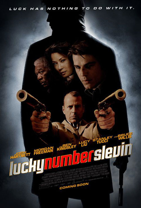

These two posters are for the same film, and they clearly display similar aspects to the film in very different ways. Red is used in both the images. The first poster has a small splash of red in the title of the film, whereas red is used as the main background colour in the second. Usage of this colour suggests that there might be blood in this film, and the guns in both posters reinforces this.
After a general discussion, the second poster is preferred, as it is much clearer and tells the audience more about the film. In the first poster, the audience are led to believe that the main character is the person in front holding the guns. This, in fact, is not true.
The first poster is mainly black, white and grey. The use of the silhouette is very effective, as this reminds the audience of 1960's horrors, and gives more clues as to the narrative of the film. The colour in the second poster includes more red, and the use of the gun to indicate the letter "L" is very effective. The positioning of the large gun also looks like a "7", confirming the audiences' belief that "Slevin" is supposed to sound like "Seven".
The posters are similar, however, because of the rule of thirds. The tag lines are at the top, the characters are in the middle and the title near the bottom. In the first poster, the eye is automatically drawn to the title, as the use of red and white stand out against the black and grey background. In the second poster, the eye is drawn to the characters and the guns, as these are the main details in an otherwise very simple poster. The character names are listed in both posters in a fairly large font. This shows the audience who is starring in the film, adding to the quality of the film. If the audience has seen the actors in other films, this may make them want to see this one also.
No comments:
Post a Comment