Stephanie Armsby 5004 , Jessica Ford 5055 and Natalie Bruce 5026. Centre 61681. Media group 10.
Labels
Alfred Hitchcock
Audience feedback
camera angles
Casting
Codes and Conventions
Costuming
Editing
Empire
Evaluation Questions
Facebook
fake blood
Film age ratings
Lighting
Location Research
magazine cover analysis
Make up
Music
Narrative
Poll
Poster
Poster analysis
poster design
Production companies
props
Questionnaire
Representation
Research into bullying
Research into horrors
Research into thrillers
Storyboarding
target audience
Teaser trailer research
titles
Tormented
Typography
website analysis
Website research
Wounds
Monday, 20 September 2010
Website Analysis - The Unborn
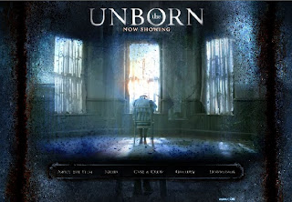
This website is very user-friendly, as it is very clearly labelled. The picture in the middle changes into a series of clips from the film at regular intervals. The blue-ish tinge to the screen shows that the genre of this film is going to be psychological and the movie clips show us that it is a horror film. Down the sides of the screen, there are blood streaks, adding to the genre. When you hover over the options at the bottom of the screen, they turn gold, to show the user what they are about to click on. The title and the options are both within the golden circle, and the person in the chair is directly in the centre of the screen. Although this person is not in the golden circle, we still look at them anyway, as they are clearly an important part of the film. The whole screen seems to be in a large blurred circle. This could mean that the fillm revolves one person, and this could be the person shown. There is one window in the centre of the screen with light showing through it. This could represent the "light at the end of the tunnel" for the person seated on the chair, or as a means of escape for the viewer.
Subscribe to:
Post Comments (Atom)

No comments:
Post a Comment