Thursday, 31 March 2011
1. In what ways does your media product use, develop or challenge forms and conventions of real media products?
Our media used forms of conventions of real media products in the genre of slasher horror. One of the camera angles used was a point of view shot. This created a sense of mystery as the audience were unaware of the identity of the villain, and this is a key convention of thrillers and horrors. We also used high angle shots on the dead bodies to show vulnerability. The location we used was not conventional of slasher horrors, as in our research we discovered that in this genre the location is usually a blood covered cell, or operating room, as seen in 'Saw'. We used a house which would seem ordinary to our target audience. We felt that by doing this, our target audience could relate to the situation and location of the house party and therefore feel more threatened and uneasy about the events that take place in the trailer. The deaths in the house took place in more conventional places, so by doing this we have developed the convention. We used stairs and a shower for scenes of death, as these two are both codes and conventions of thrillers and horrors.
The lighting we used was dim for the party and light for showing the corpses, this challenges codes and convetions as usually the gory scenes are lit dimly to show depression and hopelessness and fear, and parties and social events are filmed in the light to show equilibrium, however we challenged this by having it in reverse. This gave the effect of the party showing foreboding (combined with the eerie music) and the death scenes were in a strong light with a blue tint. This gave the effect of a 'flash forward' of the bodies being discovered the morning after, the blue tint also giving a cold feeling associated with death.
In our editing we used footage which we sped up and slowed down. This gives the effect that the villain is possibly mentally unstable or under the influence of drugs (which would fit with the codes and conventions of our trailer as it features teenagers at a party, therefore our audience would expect, or suspect misuse of drugs). We follow conventions of a slasher trailer with features of blood and death, and also fast paced editing just before the titles to create tension and excitement.
Our Mise en scene is an ordinary house, which is against codes and conventions of an ordinary slasher horror but we completely emptied the rooms shown in the trailer of any ornaments or objects that would make the home seem like it belonged to a particular social group. We dressed our victims in ordinary clothes, avoiding stereotypes of any social groups (such as 'emos' or 'chavs') to keep our target audience as open as possible, but also to make our events seem unexpected to create fear for our audience.
For our sound we used conventionally eerie sounds in the background of the deaths and leading up to them to create tension for our audience. We used a loud noise before the title which is a convention of horror as it creates stress and anxiety. We used an upbeat song for our party scene, but one that is not recognisable so the focus is on the events not the music, but also so our target audience can relate to the party. We used a mix of non diegetic and diegetic music to create equilibrium at the end of the trailer which is not a convention of slashers, it is contrapuntal to the events that happen in the trailer, we purposefully end our trailer with this to create a sense of uneasiness as the music is the first thing the audience hears before the gory events take place.
2. How effective is the combination of you main product and ancillary texts?
The trailer, poster and website are all linked because of the branding of the title. It is all written in the same font and the same colour, making the audience realise that all three are linked. The colour and font conform to the codes and conventions of the horror genre, as the usual font is red and dripping like blood. Our font is similar to this, on a black background in a very simple font, making the title stand out. This makes the audience immediately know what the genre of the film is.


The website plays the trailer automatically, which doesn’t give the audience a chance to escape. They do not choose to play the video, it plays for them without giving the audience a choice. The loading bar is red on black, giving the audience an idea of the genre before they even get to the main website.


The poster, trailer and website all show the villain’s face and a knife. The villain’s face is always concealed, so the audience never get a clear picture of him. The knife is also consistent throughout, suggesting that it plays a big part in the actual film.

The website plays the trailer automatically, which doesn’t give the audience a chance to escape. They do not choose to play the video, it plays for them without giving the audience a choice. The loading bar is red on black, giving the audience an idea of the genre before they even get to the main website.

The poster shows sweat and blood on the villain’s face, which is slightly concealed, showing that this character is mysterious, and the audience should be wary of him. He might even be the cause of the deaths seen in the trailer. There is a lot of black space at the top of the poster, which leaves room for the audience’s mind to wander, and leave them wondering what might happen in the film. The branding of the title is seen again, and the theme of red-on-black continues. The small list of directors, editors and actors and the release date is all seen on the poster, which is consistent of posters and also of the horror genre.
The main task shows many codes and conventions of the thriller genre. There is a chase, although it is not a main element of the teaser trailer, fast paced editing, there is an element of surveillance, through the camera angles. The audience are witnessing the party through the eyes of the villain. There are also micro-elements for the genre, such as blood and a knife for the horror sub-genre.
The main task shows many codes and conventions of the thriller genre. There is a chase, although it is not a main element of the teaser trailer, fast paced editing, there is an element of surveillance, through the camera angles. The audience are witnessing the party through the eyes of the villain. There are also micro-elements for the genre, such as blood and a knife for the horror sub-genre.
The trailer shows many codes and conventions of the slasher horror genre. There is fast faced editing in the death scenes and a lot is filmed in darkness. However, other films of this genre suggest that the set-up of the main action should be filmed in the light, and the actual main action, such as death scenes, should be filmed in near-darkness. We have subverted codes and conventions by reversing this. However, this does not affect the branding, as it is still a typical slasher horror.

The trailer, poster and website are all different, obviously, and show different images and different aspects of the film, but all are linked through branding. They are all obviously of the slasher horror genre as they show a similar style.
3.What have you learned through audience feedback?
After recieving a lot of audience feedback we have come to several conclusions. After previewing the trailer to our specific target audience they were asked questions on what genre of film do you think the teaser it?
 After analysing the results of this question we found that we had varied feedback on our genre. Most people assumed that the genre was horror, however we intended for the genre to be thriller horror. Through this audience feedback we have learnt that in future we would have to make our intended genre more explicit through codes and conventions such as location (however due to our narrative and low budget we stuck with the location of a house but this postively contributed to the effect it would have on our target audience). Therefore because we used an unconventional location of a house, we should have made adjustments to other codes and conventions such as involving fast paced editing, the narrative idea of involving a chase, surveillance, blood and gore, and a murder mystery type of style including police and crime.
How well do you think the trailer fits the intended genre?
 According to the audience feedback it fitted the intended genre very well, however our intended genre may not have been what they chose. We felt the piece fitted the genre of thriller horror as although we blended the genres we managed to use elements of both, however we did subvert conventions, such as gender (by using both females and males), location (by using a house instead of a city setting), camera angles (no helicoptor high angle shots, and no tracking shots), costuming (no corporate clothing, or stereotypical white clothing on the victims - we decided to relate to our target audience through stereotypical teenage fashion), and lighting (we used daylight to film death scenes subverting the usual dark dreary lighting).
What do you think was the most effective element of the trailer was?
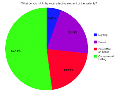 Our audience felt that our camerawork/editing was the most effective element of the trailer, and the least effective being our lighting. We agree with this to an extent as lighting was difficult without professional assistance, we could not achieve our desire of low level lighting with such a low level budget but in the future we could use lamps, torches and all sources of artificial light. Sound and props/mise en scene were equally preferred and we think this is fair as we most definitely feel that our editing/camerawork is our area of expertise however we could have improved the realistic value of the blood and make up in death scenes, and used a more varied range of sound, such as some dialogue between characters.
Who do you think the target audience is?


How well do you think the trailer fits the intended genre?

What do you think was the most effective element of the trailer was?

Who do you think the target audience is?

Our feedback told us that our target audience was definitely recognisable. This is something useful we learnt from last year, so this year we made sure that our teenage target audience was obvious. We did this through the feature of teenagers, sexuality, alcohol and a party scene, all activites that would be familiar to a stereotypical teenager. Our mise en scene and location were purposefully chosen to relate to our target audience as they would feel more threatened by the events taking place in such a familiar looking place, and especially as the victims are the teenagers themselves. To broaden our target audience we dressed our cast in casual clothing, (i.e blue jeans/skirts and t shirts) as we did not want to include any social groups as this would narrow our target audience. We tried to stay clear of representing social groups by not allowing our cast to wear logos or brands, or stereotypical items (such as burberry hats, or chains and black lipsick) this way our audience can more easily relate to our victims and feel unbiased and not prejudiced towards them.

Most people thought that the target audience would consist of both genders, which is what we were aiming for. We wanted to appeal to a wide range of teens, so we deliberately used actors of both genders in our trailer. There is no specific targeting of either gender in the trailer, so we are happy that most of the audience thought that it targets both genders.
What was the most memorable moment in the teaser trailer for you?

We found that our editing photo effect was the most popular moment of the teaser trailer and this therefore shows that our strength lies within our editing. It also suggests that if we had the opportunity to do it again we would work harder on the sound and the ending of the trailer as this was one of the least popular moments. "Dead People" was the second most popular moment in the trailer which would also show a strength within our make up and costuming as it was memorable.
In conclusion from our audience feedback we have found that our specialist area was our editing, however other aspects we would like to improve in the future would be sound and camera shots. We could do this by using a wider variety of non-diegetic and diegetic sound, and creating more experimental camera shots to give a better representation of individual characters.
4. How did you use new media technologies in the construction, research, planning and evaluation stages?
In the construction of our trailer we used cameras to film the piece. We used this equipment to our advantage experimenting with different cameras to find the best and using them to create advanced camera angles. We used the latest version of iMovie on a Macbook Pro to edit all of our footage and experimented with GarageBand to create sound. After experimenting with GarageBand we decided to use YouTube to download music and sound effects. We used an iPod and iPod speakers to create diegetic sound in our party scene, and in the beginning "weapon" scene.
For our research we deconstructed teaser trailers to follow codes and conventions and take and develop ideas. We investigated into sound by experimenting with Garageband and writing practice "club" music.
We created scenes which we sped up and slowed down and practiced adding non-diegetic and diegetic music. This helped us use the time lapses in our final teaser trailer.
We researched into codes and conventions of the thriller genre looking at conventional locations such as the shower and stairs (which we used in our teaser trailer) and typical costuming. We researched into websites, magazines and posters to prepare for our ancillary tasks mainly focusing on empire magazine, thriller websites (such as The Grudge) and interesting posters (such as Inception). We researched into conventional costuming by watching current programmes such as skins and relevant thrillers such as tormented. To decide on a production company we researched into a variety and finally decided on Warner Brothers as it was the most relevant to our genre. We also researched into age ratings and decided on an age rating of 15 as we felt this would reach our target audience. We deconstructed a lot of inspirational films, such as The Grudge, The Ring and Tormented.
We anticipated the use of camera angles and we showed this in our storyboard. From early on we decided we were going to use a piece of music which would be current and fit with our target audience, so therefore we chose an upbeat catchy song. After practice editing on iMovie we decided on the type of editing we felt would be the most appropriate and effective to our genre and this was used in the final project.
Location
We decided to base our trailer in what we represent as an ordinary middle class home, to relate to our target audience. Our logic behind this is that it will relate to our target audience and make them feel uneasy in their own middle class homes, especially as the murder scene is an unlikely place for our genre.
Monday, 20 December 2010
Initial Title ideas

Our first initial title idea was to use paper on fire however obviously this was not legible, therefore we next tried just paper by itself:

Again this was not legible so we decided to try with steam and a window:

we then tried burnt embers and ashes with blood:

next we tried wax letters (we made by burning candles) and putting them beneath a "pool" of blood:

However the blood did not look real enough therefore we finally settled for sticking the wax letters onto the window in darkness with only candles lighting it:

Thursday, 11 November 2010


Wednesday, 3 November 2010
Flashforwards
Not many films use the effect of flashforwards which we are hoping to use in our media. By analysing the TV programme "Flash Forward" we are able to analyse the different effects and embellishes used to emphasise that the scene is from the future. In the promo when there is a flashforward it is made evident through the flash on the screen and the distorted quick scenes. The colours are blurred and there is a colour enhance, some also contain a blue tint.
Production Companies
Paramount Pictures

Paramount is an American film production company. Founded in 1912 it is America's oldest existing film studio. It is ranked as one of the top grossing movie studios. It's produced horrors/thrillers such as, Dead Again, Disturbia, Next, Friday the 13th, and Paranormal Activity.
Universal Studios

Universal is one of the main 6 major American movie studios, it was also founded in 1912.
It's produced horrors/thrillers such as dead silence, the watcher, white noise, the unborn and drag me to hell.
Warner Bros

Warner Bros is an American Producer of film and television entertainment. It was found in 1918 by Jewish immigrants from Poland, Warner Brothers. It is the 3rd oldest American Movie Studio. It's produced horrors/thrillers such as The shining,Tormented, The exorcist, Psycho, Blood Work, Gothika and the Jacket.
Pathe

Pathe is a major presence within the UK film industry it has produced films such as The Queen, Tormented, Slumdog Millionaire and Chicken Run.
Slingshot
Slingshot is an all-digital, British film company that is dedicated to making good films, differently. Founded in 2006, we have produced and co-financed five movies to date. Through slate co-financing deals with BBC Films, Screen West Midlands and a multi-picture arrangement with Pathe we can bring pictures to reality quickly and effectively. Working closely with our distribution and sales partners, we assume responsibility for finding audiences for our films, taking a particularly active role in the digital marketing campaigns.They have done 5 films to date, Tormented, Sugar House, French Film, Faintheart and The Infidel.
After watching trailers and reading up on all of the films under these production companies, we've decided to use Warner Bros as it is the most appropriate to our genre and has experience of producing similar films.

Paramount is an American film production company. Founded in 1912 it is America's oldest existing film studio. It is ranked as one of the top grossing movie studios. It's produced horrors/thrillers such as, Dead Again, Disturbia, Next, Friday the 13th, and Paranormal Activity.
Universal Studios
Universal is one of the main 6 major American movie studios, it was also founded in 1912.
It's produced horrors/thrillers such as dead silence, the watcher, white noise, the unborn and drag me to hell.
Warner Bros

Warner Bros is an American Producer of film and television entertainment. It was found in 1918 by Jewish immigrants from Poland, Warner Brothers. It is the 3rd oldest American Movie Studio. It's produced horrors/thrillers such as The shining,Tormented, The exorcist, Psycho, Blood Work, Gothika and the Jacket.
Pathe

Pathe is a major presence within the UK film industry it has produced films such as The Queen, Tormented, Slumdog Millionaire and Chicken Run.
Slingshot

Slingshot is an all-digital, British film company that is dedicated to making good films, differently. Founded in 2006, we have produced and co-financed five movies to date. Through slate co-financing deals with BBC Films, Screen West Midlands and a multi-picture arrangement with Pathe we can bring pictures to reality quickly and effectively. Working closely with our distribution and sales partners, we assume responsibility for finding audiences for our films, taking a particularly active role in the digital marketing campaigns.They have done 5 films to date, Tormented, Sugar House, French Film, Faintheart and The Infidel.
After watching trailers and reading up on all of the films under these production companies, we've decided to use Warner Bros as it is the most appropriate to our genre and has experience of producing similar films.
Top Ten Thrillers
Top ten psychological thrillers:
1. The Ring
2. Sixth Sense
3. The Blair Witch Project
4. Paranormal Activity
5. The Haunting in Conneticut
6. Gothika
7. Rosemary’s baby
8. The Shining
9. Whatever happened to Baby Jane
10. The Grudge
Top 10 Thrillers:
1. The Godfather (1972)
2. The Godfather: Part II (1974)
3. Elite Squad 2 (2010)
4. Inception (2010)
5. The Dark Knight (2008)
6. Goodfellas (1990)
7. Fight Club (1999)
8. Rear Window (1954)
9. Psycho (1960)
10. The Usual Suspects (1995)
Film age ratings
Age Ratings
There are five different age ratings for all films, U, PG, 12, 15 and 18.
U (Universal)

This means the film should be suitable for all audiences ages 4 and over. The category of U only allows very mild language such as damn and hell. Occasionally language such as "bloody" or "bugger" maybe used if justified by the content. There may be brief fight scenes between characters. Moments of emotional stress or threat must be quickly resolved and the outcome reassuring. There may be some brief scary scenes and moments where characters are in danger. Violence will be balanced by reassuring elements, such as comic interludes or music.‘Baddie’ characters may carry or use weapons, but there will be no emphasis on these. Child or ‘hero’ characters are unlikely to use any kind of weapon. Potentially dangerous or imitable behaviour will not be present. A ‘U’ film can explore most themes, as long as it is appropriate to a young audience. A children’s work at ‘U’ will generally contain positive messages about loyalty, honesty and friendship, particularly amongst children. It will have a happy ending for the child.‘U’ films are unlikely to contain discriminatory language or behaviour unless it is clearly disapproved of.
PG (Parental Guidance)

This means a film is suitable for general viewing, but some scenes may be unsuitable for younger children. A ‘PG’ film should not disturb a child aged around eight or older. Some films, are given a ‘PG’ certificate but have not been made with a young audience in mind. However, the certificate means that any issues in the work are appropriate for the majority of this age group and nothing should upset a child of eight or over. No particular theme is prohibited at ‘PG’, as long as it is treated in a manner appropriate to the category. ‘PG’ works may explore challenging issues such as domestic violence, bereavement or racism. In a ‘PG’ work, illegal or antisocial behaviour, such as bullying, will not be condoned or seen to go unchallenged. There may be mild bad language such as ‘shit’ in a ‘PG’ film, but the context and delivery is always important. If the language is used aggressively or if there is too much bad language, a work may be passed at the next category. There should be no detail of violence in a ‘PG’ work, so while there might be some blood, we would not see how the injury was inflicted. Violence is generally more acceptable in a historical or fantasy setting, because of the distancing that this provides. For horror, we allow some 'jump' moments and scary scenes, but sequences showing realistic violence, horror or threat must not be prolonged. Potentially dangerous behaviour which children might copy is unlikely to be acceptable at ‘PG’, especially if it comes across as safe or fun. Realistic or easily accessible weapons, such as knives, will not be glamorised or focused upon in a ‘PG’ work.
12 (suitable for 12 and over)

The overall tone of a film and the way it makes the audience feel may affect the classification. For example, a work which has a very dark or unsettling tone which could disturb the audience would be less likely to be passed as a 12 even if the individual issues in the film were considered acceptable under the BBFC guidelines. Similarly, if a work is particularly positive or reassuring this may stop it being pushed up a category. There may be strong language at a ‘12’ but it must be infrequent. The context of the strong language is important and aggressive uses of strong language may result in a film or DVD being placed at the ‘15’ category. There is some allowance for puns on strong language at this category. There also may be moderate language at a ‘12’. Discriminatory language may be present. Aggressive use of discriminatory language (for example homophobic or racist terms) is unlikely to be acceptable at ‘12’ unless it is clearly condemned.At a 12 moderate violence is permitted but it should not dwell on detail. There should be no emphasis on injuries or blood, but occasional gory moments may be permitted if they can be justified by their context. Sexual violence may only be implied or briefly indicated. It must also have a strong contextual justification. Some horror films are passed at this category. Moderate physical and psychological threat is permitted at a ‘12’ as long as disturbing sequences are not too frequent or sustained.
15 (suitable for 15 and over)

A "15" movie can contain strong violence, frequent strong language, brief scenes of sexual violence or verbal references to sexual violence, discriminatory language or behaviour and drug taking. Occasionally there may be uses of the strongest terms although continued aggressive use will not normally be passed at ‘15’. At a ’15’ there can be strong threat and menace as long as it is not sadistic or sexualised, although the strongest gory images are unlikely to be acceptable.
18 (suitable for 18 and over)

At ‘18’ works are for adults and can contain strong issues such as, very strong violence, frequent (very) strong language, scenes of sexual violence, strong horror, strong blood and gore and discriminatory language and behaviour.
Taking all these ratings into account we have decided to make our film a 15. There will be moments of prolonged horror and it may contain some strong violence and threat. There will not be enough gore or violence to make the film an 18.
There are five different age ratings for all films, U, PG, 12, 15 and 18.
U (Universal)

This means the film should be suitable for all audiences ages 4 and over. The category of U only allows very mild language such as damn and hell. Occasionally language such as "bloody" or "bugger" maybe used if justified by the content. There may be brief fight scenes between characters. Moments of emotional stress or threat must be quickly resolved and the outcome reassuring. There may be some brief scary scenes and moments where characters are in danger. Violence will be balanced by reassuring elements, such as comic interludes or music.‘Baddie’ characters may carry or use weapons, but there will be no emphasis on these. Child or ‘hero’ characters are unlikely to use any kind of weapon. Potentially dangerous or imitable behaviour will not be present. A ‘U’ film can explore most themes, as long as it is appropriate to a young audience. A children’s work at ‘U’ will generally contain positive messages about loyalty, honesty and friendship, particularly amongst children. It will have a happy ending for the child.‘U’ films are unlikely to contain discriminatory language or behaviour unless it is clearly disapproved of.
PG (Parental Guidance)

This means a film is suitable for general viewing, but some scenes may be unsuitable for younger children. A ‘PG’ film should not disturb a child aged around eight or older. Some films, are given a ‘PG’ certificate but have not been made with a young audience in mind. However, the certificate means that any issues in the work are appropriate for the majority of this age group and nothing should upset a child of eight or over. No particular theme is prohibited at ‘PG’, as long as it is treated in a manner appropriate to the category. ‘PG’ works may explore challenging issues such as domestic violence, bereavement or racism. In a ‘PG’ work, illegal or antisocial behaviour, such as bullying, will not be condoned or seen to go unchallenged. There may be mild bad language such as ‘shit’ in a ‘PG’ film, but the context and delivery is always important. If the language is used aggressively or if there is too much bad language, a work may be passed at the next category. There should be no detail of violence in a ‘PG’ work, so while there might be some blood, we would not see how the injury was inflicted. Violence is generally more acceptable in a historical or fantasy setting, because of the distancing that this provides. For horror, we allow some 'jump' moments and scary scenes, but sequences showing realistic violence, horror or threat must not be prolonged. Potentially dangerous behaviour which children might copy is unlikely to be acceptable at ‘PG’, especially if it comes across as safe or fun. Realistic or easily accessible weapons, such as knives, will not be glamorised or focused upon in a ‘PG’ work.
12 (suitable for 12 and over)

The overall tone of a film and the way it makes the audience feel may affect the classification. For example, a work which has a very dark or unsettling tone which could disturb the audience would be less likely to be passed as a 12 even if the individual issues in the film were considered acceptable under the BBFC guidelines. Similarly, if a work is particularly positive or reassuring this may stop it being pushed up a category. There may be strong language at a ‘12’ but it must be infrequent. The context of the strong language is important and aggressive uses of strong language may result in a film or DVD being placed at the ‘15’ category. There is some allowance for puns on strong language at this category. There also may be moderate language at a ‘12’. Discriminatory language may be present. Aggressive use of discriminatory language (for example homophobic or racist terms) is unlikely to be acceptable at ‘12’ unless it is clearly condemned.At a 12 moderate violence is permitted but it should not dwell on detail. There should be no emphasis on injuries or blood, but occasional gory moments may be permitted if they can be justified by their context. Sexual violence may only be implied or briefly indicated. It must also have a strong contextual justification. Some horror films are passed at this category. Moderate physical and psychological threat is permitted at a ‘12’ as long as disturbing sequences are not too frequent or sustained.
15 (suitable for 15 and over)
A "15" movie can contain strong violence, frequent strong language, brief scenes of sexual violence or verbal references to sexual violence, discriminatory language or behaviour and drug taking. Occasionally there may be uses of the strongest terms although continued aggressive use will not normally be passed at ‘15’. At a ’15’ there can be strong threat and menace as long as it is not sadistic or sexualised, although the strongest gory images are unlikely to be acceptable.
18 (suitable for 18 and over)
At ‘18’ works are for adults and can contain strong issues such as, very strong violence, frequent (very) strong language, scenes of sexual violence, strong horror, strong blood and gore and discriminatory language and behaviour.
Taking all these ratings into account we have decided to make our film a 15. There will be moments of prolonged horror and it may contain some strong violence and threat. There will not be enough gore or violence to make the film an 18.
Target audience
The movie for our teaser trailer is based around an existing movie called 'tormented' which is described as a 'skins horror', going by this, we took costume and makeup and character ideas from both tormented and skins. Our target audience are 15-18 years old and of both genders, inevitably the same target audience as skins. This means that we will rate our movie a 15, to appeal to this audience we are going to include mild sexual scenes and gore. The trailer will be of a party (also appealing to this age range as they will relate to the situation) and will feature teenagers aged 16-18, so again, the audience will relate to the characters. To further appeal to this age range, the costumes and makeup will typically be plain jeans/t shirts/skirts, NO logos, designer labels or sportswear. Dressing our characters like this will help the audience either relate to them, or empathise with them. This is because if we have a certain social group (i.e emos) at the party, the audience will already have their own opinion of that social group and we want to avoid that. We want the audience to empathise with the characters.
Thursday, 28 October 2010
Experimenting and composing on Garage Band
This is an idea composed on garage band for the type of club/dance music we want to use during the party scene.
Tuesday, 26 October 2010
"Buried" Teaser Trailer
After analysing a range of trailers i found this one particularly indifferent, in that the whole trailer contains no video along with the audio, it is entirely made up of picture stills and audio, however it is still incredibly effective and has a heavy impact.
Tuesday, 19 October 2010
Lighting
Our main ideas for the filming and lighting of our piece is to use night and day light to our advantage. For the party scenes we will be filming in the night which creates a natural darkness for our trailer, we will be using artificial light though so we are still able to see faces and silhouttes in the darkness. For the death scenes we are going to use natural daylight (and perhaps a blue tint) to give an idea of "waking up" to reality. We may use a blue tint to our death scenes as we want the audience to realise that we are flashing into the future, and seeing the characters death.
Costume changes and ideas
Recently we have changed our original idea of using stereotypical "chavs" in our party scenes. Instead we have decided to make the piece seem a lot more like drama meets horror, similar to tormented. To do this we are analysing the clothing of dramas such as skins:


The boy characters are wearing jeans or tracksuit bottoms with simple plain designed t-shirts. The girls are dressed uniquely in their own attractive way. Each character has their own unique style which creates interest into their individual personalities. If we analyse their characters we will be able to decide what different personalities and characters we can use in our own media.
"Maxxie" is the stereotypical homosexual of the group. He wears a lot of loose and comfortable clothing as he is a dancer. His hair is light and styled loosely and his face is completely clear and smooth, he appears to have no imperfections.

"Tony" is the "Leader" of the group he usually wears a lot of simple clothing such as tracksuit bottoms or jeans with striped or plain tops. His hair is styled perfectly straight with a long fringe which sweeps across his forehead. He again has no imperfections and is portrayed as very attractive.

"Chris" is the "dim" one of the group. He usually dresses in sleeveless t-shirts with jeans or tracksuit bottoms. His signature accessory is his green flat cap which he wears for most of the series.

"Sid" is the nerd of the group and he again wears jeans with plain t-shirts or/and hoodies. His signature accessory is his "beanie" hat and his glasses. Although Sid is supposed to be the most unattractive of the males and the least desireable he still appears attractive with no imperfections.

"Anwar" is the "quiet" one of the group he dresses simply again with just jeans and t-shirts with a hoodie. He is yet again attractive and in his own way appealing.

Michelle is the "loud" one of the group, she wears a lot of make up and wears short and revealing clothing flaunting her sexuality. She yet again appears to have no flaws within her appearance making her appeal to a large audience.
"Jal" is the "intellectual" and "musical" one of the group she dresses simply and a lot less provocatively than Michelle which suits her character. She along with the rest of the characters appears beautiful with no flaws.

"Cassie" is the "weird" one she acts very strangely and this is sometimes reflected in the way she dresses. She often wears loose floaty clothing which represents her free personality. She often wears bright colours and her hair is often quite knotted or flowing which shows her "wildness". She is again attractive with no flaws in her appearance.
All the members of skins are attractive and appealing in most ways therefore all of our characters in our media "party" will have to look "perfect" with a lot of make up. Although the characters are very different they are all appealing and attractive in different ways appealing to a large audience. A lot of the characters different personalities is also reflected through their costuming. By each character of the media dressing individual we will be able to represent them in a unique way which is set with this personality however by perfecting hair and make-up we will be able to make them appear extremely attractive and with little flaws in their appearance. We are also going to avoid branded clothing.
Friday, 15 October 2010
Research into Websites
Positives of websites:
Originality through specific features of content
Eye catching colours
Interesting typography
Creative images
Interesting information and exclusives
Easy interaction
Easy transgretion of information
A good domain name
Negatives Of Websites:
Links that don't work
Links that only work with javascript
Abbreviations and jargon which make no sense to other people.
When it’s slow and takes a long time to load.
A small font thats difficult to read.
Annoying sounds
Sound you can’t turn off and constantly repeats
Annoying adverts
Colour clashes
Pointless decoration and unnecessary features which creates a cluttered look
Scrolling horizontally
Noises when clicking on a link
Things to consider when building website:
The Functionality –
Cultural awareness
Text – download order
Interaction times
Legality (copyright) intellectual property, quotations.
Design –
Graphic design – Typography
Clever graphic techniques
General aesthetics
Use of colour
Presentation of photos/shots from film
User friendly
Aesthetics
Professionalism (quality of finish)
Layout
Attention to detail
Content –
Purpose (intentions)
Simple clear wording
Clever clarity for the audience to be drawn in
Interactivity - Interaction with attendees of the website
Extra information to the film – building the desire to see it – interviews etc.
Verbal expression – clarity of grammar and use of language – spot on with spelling and punctuation – attention to detail – use of language important
Core issues – the essentials bits of the film to attract audience – integration into the website
Originality -
Uniqueness
Different ideas
Creativity
Distinctiveness – individuality – special features – multi sensory – noise – emotional expression tied into the entire website throughout – the emotion generated through the trailer
Sound editing
Predictive research – negative and positive aspects of websites – build creation of website – creates originality.
Overall Effectiveness-
All other aspects contribute to these 2 key areas.
Operational effectiveness
Communication effectiveness
Thursday, 14 October 2010
Looking dead
We have been researching all over the internet on how to look dead.
Some website have suggested mixing talculm powder and water, but from past experience we know this DOES NOT WORK! The mixture goes lumpy and useless and is not like paint as described.
We've been trying it out with some household products, such as dry flour or dry talculm powder and this has had a much better effect for creating pale looking skin.
Most website have suggested adding a blue tint to lips and eye lids, but of course this should be very subtle.
To finish off we will use fake blood.
More ideas for fake skin
We found a new recipe for fake skin (which would be used to build up more realistic fake injuries). The key ingrediant is liquid latex, which can be bought online or in fancy dress shops.
- You'll need some liquid latex (get it at just about any costume store, ask the clerk and they'll know what you're talking about), a makeup sponge, a mirror, concealer/foundation in your skin tone, and a needle/thread (optional, for doing stitches)
- Dip the sponge in the latex and pick up a little.
- Dab the latex onto the mirror to make a really thin layer. You want it to be as even as possible
- Wait for the latex to dry. Or blow-dry it on low if you're impatient.
- Continue dabbing on thin layers and drying until the latex is the thickness you want. If you're making a scar, you can do thicker, less even layers to make it look ragged, or build up very gradually for one that looks more healed over and old. If you're going to make stitches (or just some peely skin), you don't need it to be as thick, so just add layers until it's not transparent anymore.
- Peel off the latex. Try not to let the edges roll up on themselves. If they do, you can trim them off with a pair of sharp scissors or a razor blade.
- Apply a little bit of liquid latex directly to your skin and stick on the "skin". Let it dry for a moment.
If you want the skin to be really smooth, stick it with the side that was on the mirror up. If you want it to be rougher, stick it the other way. I chose the rough way. - Add more latex to blend the edge of the fake skin into your real skin. Then apply your concealer/foundation. In the picture I only blended the top left edge.
- CAREFULLY stick the needle through the "skin". Don't sew through your arm. It hurts.


Subscribe to:
Comments (Atom)