Thursday, 28 October 2010
Experimenting and composing on Garage Band
This is an idea composed on garage band for the type of club/dance music we want to use during the party scene.
Tuesday, 26 October 2010
"Buried" Teaser Trailer
After analysing a range of trailers i found this one particularly indifferent, in that the whole trailer contains no video along with the audio, it is entirely made up of picture stills and audio, however it is still incredibly effective and has a heavy impact.
Tuesday, 19 October 2010
Lighting
Our main ideas for the filming and lighting of our piece is to use night and day light to our advantage. For the party scenes we will be filming in the night which creates a natural darkness for our trailer, we will be using artificial light though so we are still able to see faces and silhouttes in the darkness. For the death scenes we are going to use natural daylight (and perhaps a blue tint) to give an idea of "waking up" to reality. We may use a blue tint to our death scenes as we want the audience to realise that we are flashing into the future, and seeing the characters death.
Costume changes and ideas
Recently we have changed our original idea of using stereotypical "chavs" in our party scenes. Instead we have decided to make the piece seem a lot more like drama meets horror, similar to tormented. To do this we are analysing the clothing of dramas such as skins:


The boy characters are wearing jeans or tracksuit bottoms with simple plain designed t-shirts. The girls are dressed uniquely in their own attractive way. Each character has their own unique style which creates interest into their individual personalities. If we analyse their characters we will be able to decide what different personalities and characters we can use in our own media.
"Maxxie" is the stereotypical homosexual of the group. He wears a lot of loose and comfortable clothing as he is a dancer. His hair is light and styled loosely and his face is completely clear and smooth, he appears to have no imperfections.

"Tony" is the "Leader" of the group he usually wears a lot of simple clothing such as tracksuit bottoms or jeans with striped or plain tops. His hair is styled perfectly straight with a long fringe which sweeps across his forehead. He again has no imperfections and is portrayed as very attractive.

"Chris" is the "dim" one of the group. He usually dresses in sleeveless t-shirts with jeans or tracksuit bottoms. His signature accessory is his green flat cap which he wears for most of the series.

"Sid" is the nerd of the group and he again wears jeans with plain t-shirts or/and hoodies. His signature accessory is his "beanie" hat and his glasses. Although Sid is supposed to be the most unattractive of the males and the least desireable he still appears attractive with no imperfections.

"Anwar" is the "quiet" one of the group he dresses simply again with just jeans and t-shirts with a hoodie. He is yet again attractive and in his own way appealing.

Michelle is the "loud" one of the group, she wears a lot of make up and wears short and revealing clothing flaunting her sexuality. She yet again appears to have no flaws within her appearance making her appeal to a large audience.
"Jal" is the "intellectual" and "musical" one of the group she dresses simply and a lot less provocatively than Michelle which suits her character. She along with the rest of the characters appears beautiful with no flaws.

"Cassie" is the "weird" one she acts very strangely and this is sometimes reflected in the way she dresses. She often wears loose floaty clothing which represents her free personality. She often wears bright colours and her hair is often quite knotted or flowing which shows her "wildness". She is again attractive with no flaws in her appearance.
All the members of skins are attractive and appealing in most ways therefore all of our characters in our media "party" will have to look "perfect" with a lot of make up. Although the characters are very different they are all appealing and attractive in different ways appealing to a large audience. A lot of the characters different personalities is also reflected through their costuming. By each character of the media dressing individual we will be able to represent them in a unique way which is set with this personality however by perfecting hair and make-up we will be able to make them appear extremely attractive and with little flaws in their appearance. We are also going to avoid branded clothing.
Friday, 15 October 2010
Research into Websites
Positives of websites:
Originality through specific features of content
Eye catching colours
Interesting typography
Creative images
Interesting information and exclusives
Easy interaction
Easy transgretion of information
A good domain name
Negatives Of Websites:
Links that don't work
Links that only work with javascript
Abbreviations and jargon which make no sense to other people.
When it’s slow and takes a long time to load.
A small font thats difficult to read.
Annoying sounds
Sound you can’t turn off and constantly repeats
Annoying adverts
Colour clashes
Pointless decoration and unnecessary features which creates a cluttered look
Scrolling horizontally
Noises when clicking on a link
Things to consider when building website:
The Functionality –
Cultural awareness
Text – download order
Interaction times
Legality (copyright) intellectual property, quotations.
Design –
Graphic design – Typography
Clever graphic techniques
General aesthetics
Use of colour
Presentation of photos/shots from film
User friendly
Aesthetics
Professionalism (quality of finish)
Layout
Attention to detail
Content –
Purpose (intentions)
Simple clear wording
Clever clarity for the audience to be drawn in
Interactivity - Interaction with attendees of the website
Extra information to the film – building the desire to see it – interviews etc.
Verbal expression – clarity of grammar and use of language – spot on with spelling and punctuation – attention to detail – use of language important
Core issues – the essentials bits of the film to attract audience – integration into the website
Originality -
Uniqueness
Different ideas
Creativity
Distinctiveness – individuality – special features – multi sensory – noise – emotional expression tied into the entire website throughout – the emotion generated through the trailer
Sound editing
Predictive research – negative and positive aspects of websites – build creation of website – creates originality.
Overall Effectiveness-
All other aspects contribute to these 2 key areas.
Operational effectiveness
Communication effectiveness
Thursday, 14 October 2010
Looking dead
We have been researching all over the internet on how to look dead.
Some website have suggested mixing talculm powder and water, but from past experience we know this DOES NOT WORK! The mixture goes lumpy and useless and is not like paint as described.
We've been trying it out with some household products, such as dry flour or dry talculm powder and this has had a much better effect for creating pale looking skin.
Most website have suggested adding a blue tint to lips and eye lids, but of course this should be very subtle.
To finish off we will use fake blood.
More ideas for fake skin
We found a new recipe for fake skin (which would be used to build up more realistic fake injuries). The key ingrediant is liquid latex, which can be bought online or in fancy dress shops.
- You'll need some liquid latex (get it at just about any costume store, ask the clerk and they'll know what you're talking about), a makeup sponge, a mirror, concealer/foundation in your skin tone, and a needle/thread (optional, for doing stitches)
- Dip the sponge in the latex and pick up a little.
- Dab the latex onto the mirror to make a really thin layer. You want it to be as even as possible
- Wait for the latex to dry. Or blow-dry it on low if you're impatient.
- Continue dabbing on thin layers and drying until the latex is the thickness you want. If you're making a scar, you can do thicker, less even layers to make it look ragged, or build up very gradually for one that looks more healed over and old. If you're going to make stitches (or just some peely skin), you don't need it to be as thick, so just add layers until it's not transparent anymore.
- Peel off the latex. Try not to let the edges roll up on themselves. If they do, you can trim them off with a pair of sharp scissors or a razor blade.
- Apply a little bit of liquid latex directly to your skin and stick on the "skin". Let it dry for a moment.
If you want the skin to be really smooth, stick it with the side that was on the mirror up. If you want it to be rougher, stick it the other way. I chose the rough way. - Add more latex to blend the edge of the fake skin into your real skin. Then apply your concealer/foundation. In the picture I only blended the top left edge.
- CAREFULLY stick the needle through the "skin". Don't sew through your arm. It hurts.


Crime scene tape
The question is, will we need crime scene tape?..
Classically, crime scene tape is bright yellow so that it will be highly visible, with black lettering and symbols such as stripes. “Crime Scene: Do Not Cross” is a popular choice for lettering, and the tape may also reference the specific agency doing the investigating, such as police or a government agency concerned with national security and criminal investigations. As a barrier, crime scene tape is primarily visual, since people can easily duck under it or step over it.
When law enforcement officials arrive at the scene of a crime, they may choose to put up crime scene tape if they feel that sensitive evidence could be damaged or compromised. Murders and other serious crimes are usually grounds for breaking out the crime scene tape, and the tape may also be used in high-profile robberies and other cases. Once the tape is strung, officers may be posted in the area to ensure that only people with authorized identification are allowed to cross the crime scene tape and enter the area.

Wednesday, 13 October 2010
Clothing
This is the basic outline of dress we are going to suggest to our actors/actresses to wear for the "chav" party:
For the males:


For the males:

Mainly baggy clothing: tracksuit bottoms, zipped or jumper hoodie, with a cap and trainers perhaps a necklace of some sort.
Female actresses could wear similar clothing to the males, tracksuit etc:
Or revealing clothing with a lot of make up, jewellery and fake tan:

Or something similar to this with a lot of typically branded clothing known as "chavwear" such as burberry, nike etc. Hoop earrings are likely to be a convincing attribute of a chav.
Representation and costuming of Chavs
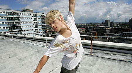
For the party scene in our media we are using a stereotype of "Chavs" by doing this we are able to create a believable party atmosphere and representing a typical group of "youths". A stereotypical group of chavs would ideally look like this:
 If we analyse the costuming of a group like this we can discover ideas for our own costuming. All of the boys are wearing hooded jackets or jumpers with the hood up over a cap, with baggy jeans or a plain dark coloured pair of shorts. The girls are all wearing caps with a relatively short top or skirt. They are wearing jewellery and bright colours and several layers. Belts are also noticeable. The typical stance of the group together is quite relaxed, the boys are leaning against the wall whilst the girls are leaning quite closely in towards the boys suggesting that the group is quite intimate. By analysing a group of people like this we are able to consider how the characters in our own media would react to eachother.
An example of a stereotypical female representation of a chav is "Vicky Pollard" from Little Britain:
 "Vicky" is again dressed in a bright pink colour similar to those in the group above. However the clothes are less revealing, a tracksuit jacket is worn presumably with tracksuit bottoms. Hoop earings are worn along with a number of gold coloured necklaces. A lot of lipliner is used along with obvious thin eyebrows. The hair is long and the top layered is tied up high on the top of the head (with a big "scrunchie"), known as the "pineapple".
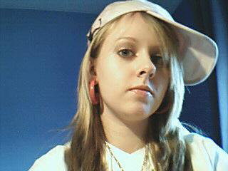 The girl as the girls shown in the group above is wearing a cap along with large hoop earrings. A gold coloured necklace can again be seen being worn and obvious highlights are evident in the girls hair. Make up is obviously worn with some use of eyeliner, a light colour on the eyelids and lip gloss. Her stance is confident and is supporting a "pouty" look towards the camera.
 A recent appearance of a "Chav" on the x factor is "chloe". She wears tight jeans, and a very revealing top only covering the top half of her upper body. The jeans also contain rips and have again a bright noticeable belt, in this case it is sparkly. She again wears a lot of gold coloured jewellery around her neck and on her wrists, fingers and ears. She has obvious extensions in her hair along with fake eyelashes and a heavy load of make up. She has written on her stomach in some form of pen and has obviously used a lot of "fake tan" to appear a darker and "oranger" skin colour. She also has a facial piercing.
A stereotypical representation of a male chav would be similar to this:
 He is again wearing a cap with his collar raised. The t-shirt is simple and plain and the facial expression he is pulling suggests a "hard" and insolent attitude. His hair is short but still visible beneath the cap.

The character is again wearing a hoodie with the hood up and expressing a "hard" insolent attitude through his facial expression and body language. The character would most likely be wearing tracksuit bottoms with the hoodie and again the hair short but still visible beneath the hood.
These stereotypes use costuming that we could use in our own media characters, and through these ideas represent believable characters.

An example of a stereotypical female representation of a chav is "Vicky Pollard" from Little Britain:


A stereotypical representation of a male chav would be similar to this:


The character is again wearing a hoodie with the hood up and expressing a "hard" insolent attitude through his facial expression and body language. The character would most likely be wearing tracksuit bottoms with the hoodie and again the hair short but still visible beneath the hood.
These stereotypes use costuming that we could use in our own media characters, and through these ideas represent believable characters.
Analysing Typography
Analysing typography will help us come up with more creative ideas for our titles and will help add interest into our final teaser trailer. The typography is a huge part of the teaser as it does not only display information relevant to the trailer but it also contributes to the codes and convetions of the genre.


 This typography has a 3D neon effect to it. Despite the fact that its pretty much incomprehendible, it is still impressive through the use of colour andc its impressive 3D effects that seem to come soaring out of the picture. The flaw of this typography seems to be the jumbling of the letters as most of the second word we are unable to make out.
 This picture is almost entirely made up of words which is highly impressive as it is almost a new form of art. The words used are obviously in some way linked to the character that is made up of them and by doing this it gives more of an insight into the character rather than if the character was just painted or drawn. By using the words a bigger representation of the character is shown. The words are mostly white but are shaded in darker and lighter shades to fit with the shadows of the picture. Some words like "misfits" and "rebels" suggests ideas of stereotyping.
 The use of colour in this image is highly significant it explores through a variety of colours and uses a unusual font. There are swirls of colour that immerge from the typography which blends into the background of the picture. The words are all made up of lines, there are no curves or rounded edges which makes the word look harsher and gives a more technological feel to the picture.
 Although this is not a total representation of words, the technology used to make it is very impressive. The clock is made up of a lot of different letters which change through light behind different letters creating a new word, and showing the time which changes often.


this is an artform made up of only words, although the words are uncomprehensible, the form in which they are presented show a literal image which shows more than words. There are a few words which are comprehendible, one of them being "Beast" which could be a discription of the overall image made up of all the typography.

The use of this type of typography shows a LITERAL representation of what the word means. The word is not only represented through letters but also through imagery, which gives a big impression on the audience and has a good impressive over all impact. The writing is clear and in a 3D format. It is in a silver/blue type of colour which gives a technological feel to the writing along with the lightening bolts and sparks coming from the overall word. Despite the business of the picture in the middle of the word, it is still comprehendible.


This i find the most impressive of most texts, as although it is only one simple letter, the way it is presented is incredibly creative and iconic. Although there is most likely a chance that the image has been photoshopped or edited in some way, it still creates a big impact. The way the letter is composed out of a variety of materials and objects is extremely imaginative and gives a sense of realism to the overall presentation of the letter.

This is incredibly intelligent and original. The word has been adapted into what appears as a fingerprint and gives a heavy impact on the audience. It gives suggestions to ulterior interpretations of the word and uses a very convincing shape to appear to blend with the rest of the image. The font is clear and comprehendible and also very imaginative and different.

This is another impressive piece of typography art. It uses the same word "Joker" (who the character in the picture is known as) repeatedly to create the image of the Joker. It is used horizontally, landscape, in small and big fonts, and in different colours to create the overall image. It is almost used as a device of shading. As you get closer to the eyes the words get darker.
Overall, among our group the most popular piece of typography is the Judge fingerprint image, it is highly effective and original and we would like to consider a similar idea for our own typography.
Poll Results
Although we only got 5 people to vote on the poll, it is clear that the audience would want to see a male victim. 4 out of the 5 votes were for a male victim, whereas only 1 out of the five were for a female victim. Therefore, we have decided to have a male victim.
More Typography


 This typography is interesting because there are two different layers of words, which both say different things. It takes a long time to understand what the bottom layer says, as it has been delibrately blocked out, but once it is understood, it is easy to understand why the two different set of words have been put together like this.
Monday, 11 October 2010
Narrative ideas
So, our new narrative idea is:
we have a victim, and the victims friend who are both bullied by a group of boys and girls from their school.
the victims friend decides to side with the bullies to prevent being bullied himself. Left alone, the victim is hurt by her only friends betrayal, and continuing to be bullied, she is pushed to her limits and decides to take revenge on the bullies, resulting in murder, also murdering her ex-friend, it is then revealed that she was in love with him, making his betrayal even more painful. As no one suspects her of the murder, and the police investigate with no leads to the victim, she becomes tormented by her own guilt and pain, and contemplates suicide.
Title ideas.
Revenge:
1. To inflict punishment in return for (injury or insult).
2. To seek or take vengeance for (oneself or another person); avenge.
Unrequited:
1. Not reciprocated or returned in kind
Scourge:
1. A source of widespread dreadful affliction and devastation such as that caused by pestilence or war.
2. A means of inflicting severe suffering, vengeance, or punishment.
3. To afflict with severe or widespread suffering and devastation; ravage.
We thought 'Scourge' would be a suitable title for our trailer because of our narrative (more details can be found in our narrative section)
Friday, 8 October 2010
Practising Fonts


In Mr Bullivant's lesson, we learned how to use the Serif program, and we had a little practice. This is only the 'tester' title; it's not decided yet. We chose the colour and font and then edited it and dragged it down, rounded off the edges and tried to make it look like blood, which fits in with the thriller genre of our trailer.
Thursday, 7 October 2010
Testing Fake Blood
This was our attempts with fake blood and deciding on what we were going to use for our media in the death scenes
Practising with photos for editing
We experimented with pictures (of my cat and Natalie) for the sound and picture effects we could use for photos in our media.
Editing Test
This is a test of editing for our party scene in our real media, we used the music by Justin Timberlake
"Sexyback" as we felt it fitted the clip best, so we would like to compose a piece of music similar to
this for our real media piece.
"Sexyback" as we felt it fitted the clip best, so we would like to compose a piece of music similar to
this for our real media piece.
Wednesday, 6 October 2010
Music Video - Jimmy Eat World
The beginning of this music video, up to where the camera stops following the girl, is something like what we want our party scene to look like. We would obviously include more shots and we would make sure that there is a clear difference between this video and ours.
Monday, 4 October 2010
Music Ideas
For the party scene our main idea was to write music under the influence of songs similar to this:
We want to use a rock genre, with electric guitars and a strong beat and sense of rhythm to fit with the party scene at the beginning and creat some contrapuntalism with the death scenes.
We want to use a rock genre, with electric guitars and a strong beat and sense of rhythm to fit with the party scene at the beginning and creat some contrapuntalism with the death scenes.
Looking at Editing - Scrubs
From about 2 minutes in, the editing is amazing. We like the fast-then-slow pace, and this is the effect we would like to have in our party scene.
Freeze framing
For the party scene in our teaser trailer we thought that freeze framing shots of people and couples then showing their death scenes was a good idea, this is an example of how we learnt to freeze frame:
Subscribe to:
Comments (Atom)