Thursday, 31 March 2011
1. In what ways does your media product use, develop or challenge forms and conventions of real media products?
Our media used forms of conventions of real media products in the genre of slasher horror. One of the camera angles used was a point of view shot. This created a sense of mystery as the audience were unaware of the identity of the villain, and this is a key convention of thrillers and horrors. We also used high angle shots on the dead bodies to show vulnerability. The location we used was not conventional of slasher horrors, as in our research we discovered that in this genre the location is usually a blood covered cell, or operating room, as seen in 'Saw'. We used a house which would seem ordinary to our target audience. We felt that by doing this, our target audience could relate to the situation and location of the house party and therefore feel more threatened and uneasy about the events that take place in the trailer. The deaths in the house took place in more conventional places, so by doing this we have developed the convention. We used stairs and a shower for scenes of death, as these two are both codes and conventions of thrillers and horrors.
The lighting we used was dim for the party and light for showing the corpses, this challenges codes and convetions as usually the gory scenes are lit dimly to show depression and hopelessness and fear, and parties and social events are filmed in the light to show equilibrium, however we challenged this by having it in reverse. This gave the effect of the party showing foreboding (combined with the eerie music) and the death scenes were in a strong light with a blue tint. This gave the effect of a 'flash forward' of the bodies being discovered the morning after, the blue tint also giving a cold feeling associated with death.
In our editing we used footage which we sped up and slowed down. This gives the effect that the villain is possibly mentally unstable or under the influence of drugs (which would fit with the codes and conventions of our trailer as it features teenagers at a party, therefore our audience would expect, or suspect misuse of drugs). We follow conventions of a slasher trailer with features of blood and death, and also fast paced editing just before the titles to create tension and excitement.
Our Mise en scene is an ordinary house, which is against codes and conventions of an ordinary slasher horror but we completely emptied the rooms shown in the trailer of any ornaments or objects that would make the home seem like it belonged to a particular social group. We dressed our victims in ordinary clothes, avoiding stereotypes of any social groups (such as 'emos' or 'chavs') to keep our target audience as open as possible, but also to make our events seem unexpected to create fear for our audience.
For our sound we used conventionally eerie sounds in the background of the deaths and leading up to them to create tension for our audience. We used a loud noise before the title which is a convention of horror as it creates stress and anxiety. We used an upbeat song for our party scene, but one that is not recognisable so the focus is on the events not the music, but also so our target audience can relate to the party. We used a mix of non diegetic and diegetic music to create equilibrium at the end of the trailer which is not a convention of slashers, it is contrapuntal to the events that happen in the trailer, we purposefully end our trailer with this to create a sense of uneasiness as the music is the first thing the audience hears before the gory events take place.
2. How effective is the combination of you main product and ancillary texts?
The trailer, poster and website are all linked because of the branding of the title. It is all written in the same font and the same colour, making the audience realise that all three are linked. The colour and font conform to the codes and conventions of the horror genre, as the usual font is red and dripping like blood. Our font is similar to this, on a black background in a very simple font, making the title stand out. This makes the audience immediately know what the genre of the film is.


The website plays the trailer automatically, which doesn’t give the audience a chance to escape. They do not choose to play the video, it plays for them without giving the audience a choice. The loading bar is red on black, giving the audience an idea of the genre before they even get to the main website.


The poster, trailer and website all show the villain’s face and a knife. The villain’s face is always concealed, so the audience never get a clear picture of him. The knife is also consistent throughout, suggesting that it plays a big part in the actual film.

The website plays the trailer automatically, which doesn’t give the audience a chance to escape. They do not choose to play the video, it plays for them without giving the audience a choice. The loading bar is red on black, giving the audience an idea of the genre before they even get to the main website.

The poster shows sweat and blood on the villain’s face, which is slightly concealed, showing that this character is mysterious, and the audience should be wary of him. He might even be the cause of the deaths seen in the trailer. There is a lot of black space at the top of the poster, which leaves room for the audience’s mind to wander, and leave them wondering what might happen in the film. The branding of the title is seen again, and the theme of red-on-black continues. The small list of directors, editors and actors and the release date is all seen on the poster, which is consistent of posters and also of the horror genre.
The main task shows many codes and conventions of the thriller genre. There is a chase, although it is not a main element of the teaser trailer, fast paced editing, there is an element of surveillance, through the camera angles. The audience are witnessing the party through the eyes of the villain. There are also micro-elements for the genre, such as blood and a knife for the horror sub-genre.
The main task shows many codes and conventions of the thriller genre. There is a chase, although it is not a main element of the teaser trailer, fast paced editing, there is an element of surveillance, through the camera angles. The audience are witnessing the party through the eyes of the villain. There are also micro-elements for the genre, such as blood and a knife for the horror sub-genre.
The trailer shows many codes and conventions of the slasher horror genre. There is fast faced editing in the death scenes and a lot is filmed in darkness. However, other films of this genre suggest that the set-up of the main action should be filmed in the light, and the actual main action, such as death scenes, should be filmed in near-darkness. We have subverted codes and conventions by reversing this. However, this does not affect the branding, as it is still a typical slasher horror.

The trailer, poster and website are all different, obviously, and show different images and different aspects of the film, but all are linked through branding. They are all obviously of the slasher horror genre as they show a similar style.
3.What have you learned through audience feedback?
After recieving a lot of audience feedback we have come to several conclusions. After previewing the trailer to our specific target audience they were asked questions on what genre of film do you think the teaser it?
 After analysing the results of this question we found that we had varied feedback on our genre. Most people assumed that the genre was horror, however we intended for the genre to be thriller horror. Through this audience feedback we have learnt that in future we would have to make our intended genre more explicit through codes and conventions such as location (however due to our narrative and low budget we stuck with the location of a house but this postively contributed to the effect it would have on our target audience). Therefore because we used an unconventional location of a house, we should have made adjustments to other codes and conventions such as involving fast paced editing, the narrative idea of involving a chase, surveillance, blood and gore, and a murder mystery type of style including police and crime.
How well do you think the trailer fits the intended genre?
 According to the audience feedback it fitted the intended genre very well, however our intended genre may not have been what they chose. We felt the piece fitted the genre of thriller horror as although we blended the genres we managed to use elements of both, however we did subvert conventions, such as gender (by using both females and males), location (by using a house instead of a city setting), camera angles (no helicoptor high angle shots, and no tracking shots), costuming (no corporate clothing, or stereotypical white clothing on the victims - we decided to relate to our target audience through stereotypical teenage fashion), and lighting (we used daylight to film death scenes subverting the usual dark dreary lighting).
What do you think was the most effective element of the trailer was?
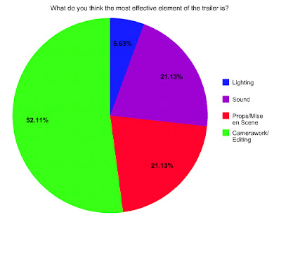 Our audience felt that our camerawork/editing was the most effective element of the trailer, and the least effective being our lighting. We agree with this to an extent as lighting was difficult without professional assistance, we could not achieve our desire of low level lighting with such a low level budget but in the future we could use lamps, torches and all sources of artificial light. Sound and props/mise en scene were equally preferred and we think this is fair as we most definitely feel that our editing/camerawork is our area of expertise however we could have improved the realistic value of the blood and make up in death scenes, and used a more varied range of sound, such as some dialogue between characters.
Who do you think the target audience is?


How well do you think the trailer fits the intended genre?

What do you think was the most effective element of the trailer was?

Who do you think the target audience is?

Our feedback told us that our target audience was definitely recognisable. This is something useful we learnt from last year, so this year we made sure that our teenage target audience was obvious. We did this through the feature of teenagers, sexuality, alcohol and a party scene, all activites that would be familiar to a stereotypical teenager. Our mise en scene and location were purposefully chosen to relate to our target audience as they would feel more threatened by the events taking place in such a familiar looking place, and especially as the victims are the teenagers themselves. To broaden our target audience we dressed our cast in casual clothing, (i.e blue jeans/skirts and t shirts) as we did not want to include any social groups as this would narrow our target audience. We tried to stay clear of representing social groups by not allowing our cast to wear logos or brands, or stereotypical items (such as burberry hats, or chains and black lipsick) this way our audience can more easily relate to our victims and feel unbiased and not prejudiced towards them.

Most people thought that the target audience would consist of both genders, which is what we were aiming for. We wanted to appeal to a wide range of teens, so we deliberately used actors of both genders in our trailer. There is no specific targeting of either gender in the trailer, so we are happy that most of the audience thought that it targets both genders.
What was the most memorable moment in the teaser trailer for you?

We found that our editing photo effect was the most popular moment of the teaser trailer and this therefore shows that our strength lies within our editing. It also suggests that if we had the opportunity to do it again we would work harder on the sound and the ending of the trailer as this was one of the least popular moments. "Dead People" was the second most popular moment in the trailer which would also show a strength within our make up and costuming as it was memorable.
In conclusion from our audience feedback we have found that our specialist area was our editing, however other aspects we would like to improve in the future would be sound and camera shots. We could do this by using a wider variety of non-diegetic and diegetic sound, and creating more experimental camera shots to give a better representation of individual characters.
4. How did you use new media technologies in the construction, research, planning and evaluation stages?
In the construction of our trailer we used cameras to film the piece. We used this equipment to our advantage experimenting with different cameras to find the best and using them to create advanced camera angles. We used the latest version of iMovie on a Macbook Pro to edit all of our footage and experimented with GarageBand to create sound. After experimenting with GarageBand we decided to use YouTube to download music and sound effects. We used an iPod and iPod speakers to create diegetic sound in our party scene, and in the beginning "weapon" scene.
For our research we deconstructed teaser trailers to follow codes and conventions and take and develop ideas. We investigated into sound by experimenting with Garageband and writing practice "club" music.
We created scenes which we sped up and slowed down and practiced adding non-diegetic and diegetic music. This helped us use the time lapses in our final teaser trailer.
We researched into codes and conventions of the thriller genre looking at conventional locations such as the shower and stairs (which we used in our teaser trailer) and typical costuming. We researched into websites, magazines and posters to prepare for our ancillary tasks mainly focusing on empire magazine, thriller websites (such as The Grudge) and interesting posters (such as Inception). We researched into conventional costuming by watching current programmes such as skins and relevant thrillers such as tormented. To decide on a production company we researched into a variety and finally decided on Warner Brothers as it was the most relevant to our genre. We also researched into age ratings and decided on an age rating of 15 as we felt this would reach our target audience. We deconstructed a lot of inspirational films, such as The Grudge, The Ring and Tormented.
We anticipated the use of camera angles and we showed this in our storyboard. From early on we decided we were going to use a piece of music which would be current and fit with our target audience, so therefore we chose an upbeat catchy song. After practice editing on iMovie we decided on the type of editing we felt would be the most appropriate and effective to our genre and this was used in the final project.
Location
We decided to base our trailer in what we represent as an ordinary middle class home, to relate to our target audience. Our logic behind this is that it will relate to our target audience and make them feel uneasy in their own middle class homes, especially as the murder scene is an unlikely place for our genre.
Subscribe to:
Comments (Atom)